
If you follow me on twitter, you may have noticed I watch docs. In the past couple of years, I've watched nearly a hundred of them (complete list below). Of course I watch them because I enjoy them, but I have been also learning the techniques, modes, and styles I like (or dislike) because for my MFA thesis I am going to be making my own. Starting this summer.
I will be documenting the process here from time to time, and to kick things off I thought I would just collect some thoughts on a few of the standout docs from the big list. These aren't necessarily the best of the bunch or even my favorites, but they do represent the docs I believe I've learned from the most.
Dear Zachary. This little doc is rough around the edges, but underneath some of the cruder aesthetics is a devastating story expertly told. I can only imagine how difficult it must have been for the documentarian to pull this movie together, and he does it so effectively. I can't imagine anyone not having an emotional reaction to it.
Fast, Cheap & Out of Control. Errol Morris is always pushing the boundaries of the medium. This doc may be quirky and gimmicky, but personally, I found the editing of Fast, Cheap & Out of Control to be eye-opening. When I think about my own project, this doc always comes to mind as a personal challenge to think about the visual and sound editing and how I can use them to make my piece even stronger.
Manda Bala. I have to admit that I wasn't really looking forward to seeing a doc about kidnapping and corruption in Brazil. But from the first few minutes of Manda Bala (Send a Bullet), I was hooked by the teaser. I don't think I'd ever given much thought to those first few minutes before. The teaser (I like to call it the "xa") is the little scene right before the opening credits. It's where you put one of the strongest quotes that will set up the themes for the rest of the movie. Manda Bala was a great lesson in how to show the theme visually and skipping the chitchat.
Stone Reader. To me this one stands out as on of the worst of the docs I've watched. According to Rotten Tomatoes, I am clearly in the minority, but I felt the movie was incredibly self-indulgent. Two hours plus of a guy looking for an author, who isn't really hiding from anyone, left me feeling like the director just wants me to think he's smart and well read. I should say I have a general dislike of documentarians who feel like they need to insert themselves into the story without a really good reason for it. There were a number of docs in the list that I felt really would have been stronger if the directors stuck to the intricacies of the story rather than trying to be a star (Beer Wars, Stripped), but this one takes the prize. I also have a general hate of documentaries that feel fake, and there were just too many examples of shots that had to be staged for me to enjoy watching this movie.
A Certain Kind of Death | A State of Mind | The Atomic Cafe | Beer Wars | Bigger, Stronger, Faster | Born Into Brothels | Brick City | Capitalism: A Love Story | Cocaine Cowboys | Comic Book Confidential | Confessions of a Superhero | Connections Series 1 | Cosmos: The Shores of the Cosmic Ocean | Crips and Bloods: Made in America | Cropsey | Crumb | Danielson: A Family Movie | Dear Zachary | Double Dare | Encounters at the End of the World | Enron: The Smartest Guys in the Room | Every Little Step | Exit Through the Gift Shop | F for Fake | Fall from Grace | Fast, Cheap & Out of Control | Food Inc. | Grey Gardens | Guns, Germs, & Steel | Harlan County, U.S.A. | Hearts and Minds | Helvetica (again) | I Have Never Forgotten You | I Like Killing Flies | Imaginary Witness | In the Realms of the Unreal | It Might Get Loud | Jesus Camp | Ken Burns' Civil War (again) | Ken Burns' Jazz | King Corn | Little Dieter Needs to Fly | loudQUIETloud | Lynch | Man on Wire | Manda Bala | Manufacturing Dissent | Michael Jackson's This Is It | Mr. Death: The Rise and Fall of Fred A. Leuchter, Jr. | Murderball | My Kid Could Paint That | No Direction Home: Bob Dylan | Objectified | OT: Our Town | Outfoxed: Murdoch's War on Journalism | Overnight | Planet B-Boy | Revolution OS | Roger & Me | Roman Polanski: Wanted and Desired | Scratch | Sherman's March: A Meditation on the Possibility of Romantic Love In the South During an Era of Nuclear Weapons Proliferation | Sister Helen | Stone Reader | Stripped | Tales from the Script | The Business of Being Born | The Face Is Familiar | The King of Kong (again) | The Order of Myths | The September Issue | The Thin Blue Line | The Way We Get By | This American Life: Seasons 1 and 2 | This Film Is Not Yet Rated | Up Series | Very Young Girls | Wal-Mart: The High Cost of Low Price | Witch Hunt | Word Wars | World's Most Dangerous Gang
Showing posts with label dotcom. Show all posts
Showing posts with label dotcom. Show all posts
Friday, June 3, 2011
Thursday, March 24, 2011


Thursday, March 10, 2011

Last semester in my Design Business Link class, we were paired with a local nonprofit organization to help them with their design and marketing needs. I was on a team that got to work with People's Community Health Center, which serves the un- and under-insured in Baltimore. We were asked to help brand and advertise their new dental office, and one of our recommendations was to do graphic wall decals in the clinic to tie in the brand and brighten up the place. I am pleased/relieved! to say those decals are now up and ready for the grand opening on Saturday (thanks to the help of my long-suffering spouse).

Campaign posters coming soon to a bus shelter near you (assuming you are someone who lives in our around the Anne Arundel area).
I also hope to have some minty fresh news to announce soon.
Thursday, February 3, 2011
I actually had some free time this weekend, and instead of updating my blog (hey, it's only been six months since my last post), I designed a few business card for Minted.com's Stay in Touch Business Card Challenge. Here are the finished products:
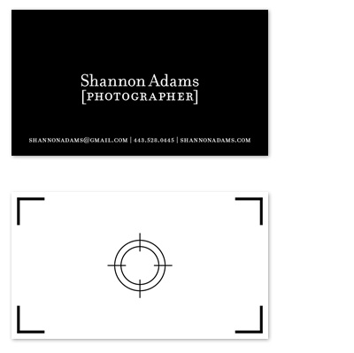


You can even vote for them if you feel so inclined but don't feel like you have to. Oh! And they have really cute stuff you can buy like this and this and this and this...
You can even vote for them if you feel so inclined but don't feel like you have to. Oh! And they have really cute stuff you can buy like this and this and this and this...
Sunday, August 22, 2010


Monday, August 2, 2010

Thursday, July 29, 2010

I've been designing invitations for a party my sister and I are throwing my mom to celebrate a milestone birthday. A perfect excuse for letterpress, right? I'm also trying to finagle a field trip to Typecast Press to see my invites come off the press. If I do, I promise to post pictures. In the meantime, I'm loving all the great letterpress stuff out there, and here are a few of my favorites.


from Lemon and Lavender, Orange Beautiful, Bella Figure, JP Gary & Kiera Ormut-Fleishman, Sycamore Street Press, Jessica Hische, Gilah Press + Design, Ty Mattson, and Hello Tenfold.
Friday, March 26, 2010

Tuesday, March 9, 2010
Thursday, March 4, 2010
Sunday, February 28, 2010
I'm taking an ActionScript class this semester, and I'm surprised by how much I'm learning and (shock!) enjoying it. For our final project, we are going to be developing a Flash game, but in the meantime we've been working on these cat video games:

Nervous

Enclosed
OK, so they aren't really cat video games, but Pumpkin Escobar seems to like them...

Nervous

Enclosed
OK, so they aren't really cat video games, but Pumpkin Escobar seems to like them...
Wednesday, February 10, 2010

It's time for my semi-annual blog posting! In my last post, I mentioned this poster series for my Advanced Graphic Design class. The assignment was to design posters for three films by one director. The director I chose was Billy Wilder, and I focused on three of his films noir, Double Indemnity, The Lost Weekend, and Sunset Boulevard. I also designed the condensed modern typeface I used for the film titles (I call it Bill Noir), and I am pretty pleased with the final product (definitely click on the image for more detail).
Anyway, no promises, but if this snow keeps up, I might post again before July.
Friday, September 25, 2009

In my advanced graphic design class we are going to be designing a poster series advertising a hypothetical AFI event celebrating the work of a director featuring three of his films. The director I've chosen is Billy Wilder. A contemporary of auteurs like Orson Welles and Alfred Hitchcock, Billy Wilder is much more understated and in my opinion underrated. Not only was he one of the preeminent directors of the film noir era but also continued to consistently produce great films for over 50 years. The three movies I am focusing on are Double Indemnity, The Lost Weekend, and Sunset Boulevard. In addition to the poster we are going to be designing a typeface (YAY!) to reflect the style of the director and/or films. So I have been researching handdrawn titles from the 1940s. Some inspiration.
Monday, September 21, 2009
Friday, September 18, 2009
I was watching the Typophile Film Fest opening title sequence and was reminded of how much I love the intersection of meat and typography. So, I thought I would just post a few meaty typefaces as well as beefjerky business cards. I even found a magazine called Meatpaper that is all about art and ideas about meat.


And what goes better with meat than potatoes. There's even a time-lapse video.


And what goes better with meat than potatoes. There's even a time-lapse video.

Tuesday, September 1, 2009
Tuesday, July 28, 2009
I am organizing my video projects to put them up on my site and came across this one from my previous video class (not the one this summer) and thought I would share it. The assignment was to edit together a three-minute video about your day based on the sound.
Thursday, July 23, 2009
The audio production project from my summer video class: I Am Poseidon! God of the Sea! I Also Teach Water Aerobics On Saturdays by Colin Nissan, published in McSweeney's, and read by Aaron Royer.
Friday, May 8, 2009
Holy moly! Two month with no updates. I thought I would post some of the work that's been keeping me so busy during the weeks and weeks I've been away.

For my Design Principles and Strategies class we had to design a brand identity for a fictional English tea shop in the trendy Fells Point neighborhood. I choose the name Grey (a play on London weather and English tea varieties). We also had to use our logo to design a number of items including tea packaging (from left to right: Classic Grey, Double Bergamot, and Green Citrus).

For my Design Principles and Strategies class we had to design a brand identity for a fictional English tea shop in the trendy Fells Point neighborhood. I choose the name Grey (a play on London weather and English tea varieties). We also had to use our logo to design a number of items including tea packaging (from left to right: Classic Grey, Double Bergamot, and Green Citrus).

Tuesday, March 3, 2009
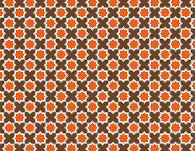
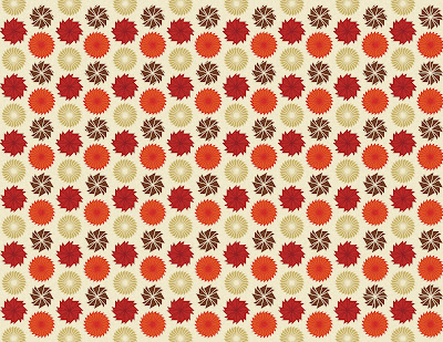
In my Design Principles and Strategies class, I've been doing a lot of abstract compositions to demonstrate, well, design principles and strategies--not much that I would want to share. But I thought I would go ahead and post this week's assignment, which was to make patterns demonstrating the concepts of repetition, similarity, and anomaly because patterns are purdy.

Just one more week of abstract concepts (YAY!), and then we'll be doing some book covers, a series/set of three. I think I am going to do a series of Modern American Classics, including Blood Meridian by Cormac McCarthy, American Pastoral by Philip Roth, and White Noise by Don DeLillo. Gotta get reading...


Just one more week of abstract concepts (YAY!), and then we'll be doing some book covers, a series/set of three. I think I am going to do a series of Modern American Classics, including Blood Meridian by Cormac McCarthy, American Pastoral by Philip Roth, and White Noise by Don DeLillo. Gotta get reading...
Subscribe to:
Posts (Atom)