Showing posts with label Type. Show all posts

Thursday, February 3, 2011

I actually had some free time this weekend, and instead of updating my blog (hey, it's only been six months since my last post), I designed a few business card for Minted.com's Stay in Touch Business Card Challenge. Here are the finished products:


You can even vote for them if you feel so inclined but don't feel like you have to. Oh! And they have really cute stuff you can buy like this and this and this and this...

Sunday, August 22, 2010

Just a few pics of the letterpress invites I designed for my Mum's 60th birthday party. I also designed a custom return address stamp.


Monday, August 2, 2010


Just bought this great type print. Love it. What typographic mustache are you?

Wednesday, February 10, 2010


It's time for my semi-annual blog posting! In my last post, I mentioned this poster series for my Advanced Graphic Design class. The assignment was to design posters for three films by one director. The director I chose was Billy Wilder, and I focused on three of his films noir, Double Indemnity, The Lost Weekend, and Sunset Boulevard. I also designed the condensed modern typeface I used for the film titles (I call it Bill Noir), and I am pretty pleased with the final product (definitely click on the image for more detail).

Anyway, no promises, but if this snow keeps up, I might post again before July.

Friday, September 25, 2009


In my advanced graphic design class we are going to be designing a poster series advertising a hypothetical AFI event celebrating the work of a director featuring three of his films. The director I've chosen is Billy Wilder. A contemporary of auteurs like Orson Welles and Alfred Hitchcock, Billy Wilder is much more understated and in my opinion underrated. Not only was he one of the preeminent directors of the film noir era but also continued to consistently produce great films for over 50 years. The three movies I am focusing on are Double Indemnity, The Lost Weekend, and Sunset Boulevard. In addition to the poster we are going to be designing a typeface (YAY!) to reflect the style of the director and/or films. So I have been researching handdrawn titles from the 1940s. Some inspiration.

Friday, September 18, 2009

I was watching the Typophile Film Fest opening title sequence and was reminded of how much I love the intersection of meat and typography. So, I thought I would just post a few meaty typefaces as well as beefjerky business cards. I even found a magazine called Meatpaper that is all about art and ideas about meat.


And what goes better with meat than potatoes. There's even a time-lapse video.

Thursday, July 23, 2009


I must find away to make this mine. Anyone have £2,700.00 they could lend me?

Wednesday, June 17, 2009

Thursday, May 14, 2009

Randomly stumbled upon some amusing compositions from Silhouette Masterpiece Theatre.


Thursday, January 8, 2009

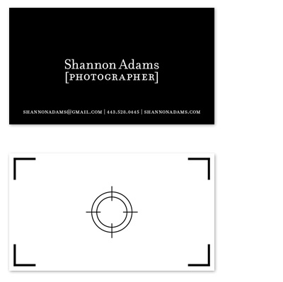
In addition to working on my website, I've also been designing my business card, so I thought I would post the (almost definitely) final design.

Tuesday, December 23, 2008


So I am {finally} working on my website again and going through my work to-date and came across a couple of Christmas-themed projects that have never seen the light of day. I am fond of both of them. So I thought I'd post them here. The first is a Christmas card I designed last year, but didn't get them done in time to have them letterpressed. Have I mentioned I like type? Because I really like type, especially when it's punny.


I was also working on a design for a Christmas CD a few months back, but things fell apart, and the client was interested in going in a different direction. Humbug! Oh well, Merry Christmas.

Wednesday, December 10, 2008


There's a great design challenge this week over at Typophile. I am posting my submission because I like to not post anything for a really long time and then post a lot in two days (Have you noticed?). My design is a bit morbid, but that was the luck of the draw. The rules of the challenge are:

1. Create a book cover, using a fictitious title and an image from the LIFE photo archive.

2. To get your title, click on the Wikipedia Random Articles page and whatever topic you get is the title.

3. Head over to the LIFE photo archive and enter the title (or part of the title) as your search term. Use any image from the search result for your book.

Hopefully, I can stay on top of Type Battles and post one each week at least while I'm on break.
Tuesday, August 19, 2008


From YTMND, I got about 20 of them...

Monday, May 5, 2008


I really like the ambigram on the cover of the 20th Anniversary Edition of the Princess Bride. How do they do it...

Tuesday, April 8, 2008


[Click to enlarge]

Advertising Agency: Ogilvy, India
Executive Creative Director: Piyush Pandey
Creative Directors: Abhijit Avasthi, Shekhar Jha, Mahesh Gharat
Art Director / Designer: Makarand Joshi
Copywriter: Anurag Agnihotri

Wednesday, March 12, 2008


I can't stop looking at this poster for Funny Games, opening this Friday. As much as the picture is mesmerizing, it's the typography I'm in love with. It's a simple, unexpected solution that creates great visual tension. I love it. Designed by Creative Crew.

Tuesday, March 11, 2008


"The Oscars of Type Design"
Typographica’s fourth annual review showcases the best in new typeface design.

Thursday, February 21, 2008

I find this site completely amusing. I can't help clicking over and over again...